You’ve shipped this creative campaign before. Three options went into review, the Art Director chose one, and it became the hero across the launch, the paid social cutdowns and the out-of-home. The client signed off without a second thought.
Nobody objected to the image at any point, and the image did nothing. It was competent and on brief. It could have been a grey rectangle and the advertising would have performed about the same.
That is the expensive failure, and it never announces itself. There is no meeting where someone says the photograph is fine and therefore useless.
“Stock imagery is always a struggle in the design space, as visuals need to be specific to cater to what you need,” says Dan George Hill, a graphic designer. “There are endless options, but you never seem to hit the right ones.”
So try treating authenticity as a relationship between one image and one brand rather than as a quality the photograph carries around by itself. The same frame can be honest for your client and dishonest for the next one, which turns this into a judgment problem rather than a search problem. But judgment can be taught.
What follows is two tests for judging a frame, and two habits that change what shows up in front of you in the first place. Where you look sets the ceiling on all of it, and we covered that separately in Where to License Authentic Commercial Photos.
What is authentic for brands?
The standard advice treats authenticity for brand visuals as something you detect by inspection: natural light, staged laughter, the hands.
That advice assumes your audience runs the same forensic check you do, and the evidence says they do not.
In August 2026, the Nielsen Norman Group published a study that should make anyone in this business a little uncomfortable. Researchers showed 77 US adults six versions of a fictional consulting firm’s webpage, each carrying either an AI-generated or a stock photograph as the hero image, then asked them to rate the company on trust, professionalism and authenticity after ten seconds of looking. The pages with AI-generated images scored slightly higher: on authenticity, a 0.4-point gap on a seven-point scale. Participants were never told AI was involved, and when they suspected it had been, they rated the site less favorably. What moved the ratings was suspicion, not detection. The authors are careful about the limits, and so should you be: small sample, one industry, one kind of workplace image, one exposure length.
Take the finding seriously anyway, because the honest conclusion is more useful than the defensive one. A ten-second trust rating is not what a campaign hero is bought to do. Photos are licensed so the brand is still recognizable in six months, so the hero holds up on an out-of-home panel and in a 4:5 crop, so the paid social set holds together, so a competitor’s launch does not look interchangeable with theirs.
Getty found the same tension from the other direction. In its Building Trust in the Age of AI report, drawn from surveys of more than 30,000 adults across 25 countries, 98% of consumers agreed that authentic images and video are highly important in establishing trust, while 76% agreed it is getting to the point where they cannot tell whether an image is real. People say authenticity is essential, and people admit they cannot reliably spot it.
So the case for authentic imagery was never really about detection. It is about relevance, and that argument is older than the AI debate and holds up regardless of how it gets resolved.
Jakob Nielsen’s eyetracking work, published in 2010 and still the reference point, found that people study photographs carrying information they actually need and skip photographs that are there to decorate. Portraits of real employees on a company site pulled about 10% more viewing time than the biographies printed beside them, even though the text took up far more space. A photograph on a university application page went ignored entirely, and it made no difference whether the students in it were real or hired. The variable that predicted attention was whether the image was doing a job.
The question arises whether generic stock is something a brand needs. The answer to this question is nuanced. Let’s unpack it below.
“Many traditional stock websites feel very basic, dry, and fake,” says Allyssa Ellis, an artist and designer. “They don’t feel warm or inspiring and often look the same.”
A generic image occupies a paid slot and returns nothing, because it says nothing your competitor’s version of the same slot does not already say.

Two tests that take ten seconds
If authenticity is fit, then judging an image means testing fit. Two tests do most of the work, and both are fast enough to run on a shortlist during a review.
The swap test
Put a competitor’s logo on the image. If nothing about it becomes wrong, the image is not yours.
That is the whole test. A photograph that sits comfortably under any brand in the category is a placeholder you have paid for. The overhead laptop-and-coffee shot passes every quality check ever written and passes straight to your competitor with no adjustment at all.
What makes it useful is that it converts a vague reaction into an arguable point. “This feels generic” loses an argument with a Creative Director. “Any of the four brands we pitched against could run this tomorrow” wins one.
It also catches something a keyword search cannot; search rewards subject match, and the swap test measures ownability.
The test also tells you where to spend the effort, because generic imagery does not cost the same everywhere. A hero, an out-of-home panel or the first frame of a paid social ad gets looked at properly, so a placeholder in those slots is money spent on nothing. A supporting image three scrolls down mostly gets scanned, and it can be more ordinary without doing any harm.
Paid social is the hardest of the three. Your ad sits between things real people actually posted, so an image that reads as advertising stock is competing on the worst possible terms. Run the swap test hardest on anything going into a feed.
The caption test
Write one sentence describing what is happening in the frame. If the only true sentence you can write is “team collaborating” or “woman enjoying product,” you have found a category rather than a photograph.
Specificity in language tracks specificity in the image. A frame with a real moment in it produces a sentence with a verb, a place, and a consequence: someone is doing something somewhere, and something follows from it. A generic frame produces a stock keyword, which makes sense, because a keyword is what it was made to satisfy.
The sentence has a second life as it becomes the argument you take into the review when the Art Director asks why this one, which cuts through the approval churn that eats a designer’s week.
One trap worth naming. An image can pass the caption test and still fail the swap test, because something specific is happening in the frame and none of it is specific to your brand. Run both, in that order.
“Find what you can bring to the table in type or photo that no one else can,” says Jessica Walsh, founder of &Walsh. That is the standard both tests are measuring against.
Your brief is why everything looks the same. Humanize it!
Both tests tell you what to reject. Getting better candidates in front of you is a different problem, and it starts before you open a search box.
You cannot search for an adjective. Warm, elevated, human, aspirational: none of these are properties a library can filter on. So the search box quietly converts your adjective into the nearest available subject noun, and the nearest available subject noun is exactly what every other team in your category typed in.
The convergence starts in the brief. The step you don’t want to skip consists in turning each brand adjective into the visual attributes that would actually produce it.
| Brief says | Which is unsearchable, so specify | Which you can filter or scan for |
|---|---|---|
| Warm and human | People mid-action rather than posed to camera, hands doing something, a room that shows use | Composition, distance from subject, time of day |
| Premium | Controlled light, restraint, negative space, a single subject | Composition, ratio, color |
| Energetic | Motion in the frame, direct flash, saturated palette, tight crop | Color, ratio |
| Approachable | Domestic or street environments, imperfect surfaces, natural light | Time of day, composition |
| Aspirational | Where the shot was taken from rather than what it shows, a horizon, a scale cue, an unfamiliar place | Composition, color, location |
Those attributes in the third column are what a search built for design decisions filters on. On Stills that means composition, ratio and color, so you can specify the shot rather than the subject.
Run one row through it. The brief says warm and human, translated, that is people mid-action rather than posed, hands doing something, a room that looks lived in. Now there is something to filter on: a wider composition that keeps the room in the frame, and the two warm tones from the brand palette locked in as color. What comes back is a short, specific set rather than four hundred variations on a happy team.
Filtering by color does a second job worth naming. Holding a brand palette across licensed imagery is close to impossible when your only tool is a keyword box, and the usual workaround is grading the images afterwards until they match, which changes the photograph and normally shows. Starting inside the palette avoids the problem instead of correcting it.
“The search filters are great,” says Gabby Lord, co-founder of Super Keen. “I love being able to filter by options like color and camera angles.”
The shortlist is also easier to defend. You did not pick these five because they felt right, you picked them because they match attributes the brief already named, and that sentence is the note that goes to the client.
That defensibility isn’t free, though, and it’s worth being honest about the trade. This is slower for the first ten minutes and faster for the next two hours. Almost all sourcing time goes into rejecting, and a specified brief is the only thing that shrinks the reject pile.
Shortlist photographers, not photos
The default behavior goes like this. You search, you collect frames from twenty different photographers, and you end up with a set that shares a subject and nothing else. The light is inconsistent, the wardrobe logic never agrees with itself, and the tone jumps from frame to frame.
That is a collage you get on the majority of stock image sites, and it is why campaigns based on that imagery look assembled.
Start from the artist page
The inversion is simple. When a frame works, do not add it to a pile. Open the artist, because their body of work is where the rest of the sensibility already lives, consistent by default, made by one person with one point of view.
Then run the second-frame test: look at the photographer’s next image, not the one you found. One good frame is a coincidence, but a body of work is a sensibility you can build forty deliverables from.
This only works if the platform is built for it. On Stills every image traces back to a named artist whose full body of work you can browse, which is a consequence of how the roster is assembled. Photographers apply for representation rather than uploading freely, so an artist page reads as a career rather than an upload history.
The roster is international, with artists working in London, Los Angeles, Paris, Toronto, Accra and Chennai, and that range shows up as different light, different streets and different cultural specificity brought to the same brief.
“The main thing I really like about Stills is how high-quality the images are,” says Jesse Nyberg, a designer. “They are diverse in subject matter and very tasteful compared to the other stock image sites. The entire platform feels very artist-first.”
There is a practical benefit that turns up in the meeting rather than in the layout. A client asking who shot this is a completely normal question, and “I don’t know” is not a normal answer. With a credited artist, the question already has one before anyone asks it.
None of that helps, though, if the shortlist itself is still a loose pile of downloads by the time you get to the meeting.
Build the board
Boards are where the method turns into a working habit. Collect by artist rather than by frame, and what you have at the end of the afternoon is a direction instead of a folder.
Two things make a board more useful than a download queue. It holds the reasoning, because the images sit beside each other and a frame that does not belong becomes obvious in a way it never does inside a grid of search results. It also travels, so the Art Director and the client react to the same set instead of to three attachments in a thread.
Keep them by territory rather than by campaign. A board called warm interiors, natural light outlives the brief it was built for, and it gets better every time you add to it. A board called Q3 launch dies with the launch.
The compounding benefit lands on your next campaign. Two or three artists you trust is a shortlist you can reuse next quarter, and scroll fatigue is mostly a symptom of starting from zero every single time.

When “authentic” becomes its own cliché
Candid has its own clichés now, the same way the boardroom handshake once did.
Direct flash, blown highlights, the messy desk, the mid-blink laugh. It all reads as unstaged, and plenty of it takes more production effort than the polish it replaced.
“We want to see more of the rough, the real, and the approachable,” says Victoria Stefania, a content creator, and she is describing the trend accurately. The trouble is what happens next. Any look that signals authenticity becomes a style once enough brands copy it, and a style is available to your competitor by Friday.
So a grainy flash portrait fails the swap test just as fast as a stock boardroom does. If anyone in the category could run it unchanged, the texture never mattered.
Match the register to the brand instead of to the trend. Some brands are genuinely precise, and imperfection reads on them as costume. Ask whether the image is true here, because raw enough is the wrong question.
Here’s the whole method, compressed.
The ten-minute version
Compressed to something you can keep beside the keyboard.
1. Write the brief in attributes, not adjectives: behavior, light, environment, palette, distance.
2. Filter on the attributes you can actually filter on: composition, ratio, color.
3. Find one frame that works, then open the photographer rather than the pile.
4. Run the second-frame test. If the rest of the body of work holds, you have a source for the whole campaign.
5. Shortlist five frames into a board, organized by territory rather than by campaign.
6. Run the swap test on each, and delete anything a competitor could run unchanged.
7. Run the caption test on what survives. The sentence you write is the argument you take into the review.
Where this leaves you
What you are looking for is a photo that is true here, for this brand, in this slot. That is why better search terms never fixed the problem, and why the lists of visual tells may keep failing you.
“Photography’s role in design is to bring warmth, realness, and texture, and the Stills collection effortlessly delivers,” says Dani Hunt, founder and creative director of Neverland Studio. “In an AI landscape, this is crucial.”
When the image is carrying the work, browse the Stills catalog or reach out to us directly.
Frequently asked questions
Here are a few questions that tend to come up alongside this.
Increasingly you cannot all the time, and neither can your audience. Getty’s consumer research found that 76% of people agree they are reaching the point where they cannot tell whether an image is real. A more useful question is whether the image is specific enough that only your brand could run it.
The same creative tests apply, but the bar is higher for ads. An ad gets only a glance, amid everything else competing for attention, so a hero image, billboard, or paid social frame must pass the swap test immediately. An image deeper on a website has an easier job because visitors have already chosen to be there.
Specify the brief in visual attributes rather than adjectives, filter on composition and color rather than subject keywords, and shortlist photographers rather than individual frames. Almost all of the improvement comes from those three changes, not from better search terms.
That last habit depends on where you are looking. It only works on a library that credits the photographer and lets you browse their whole body of work, which is how the Stills roster is built. Worth trying on your next brief.
No. Candid is a style, and once enough brands adopt a style it becomes as reproducible as any other. Deliberate imperfection is frequently more staged than the polish it replaced. What decides is fit to the brand rather than surface texture.
Not in the way people usually mean. When the Nielsen Norman Group showed people a webpage for ten seconds, the AI-generated photos scored slightly higher on trust than the stock photos did. It was a small study covering one industry, so it is not the last word, but it does suggest your audience is not judging photography the way you do.
The payoff shows up elsewhere. An image your competitor could run tomorrow does nothing for your brand, however good it looks. Distinctive photography earns its cost over months, not in the first ten seconds.
Filter by color at the point of search rather than correcting afterwards. On Stills you can narrow by color alongside composition and ratio, so the set sits inside the palette from the start. Grading licensed images into a palette after the fact changes the photograph, and on skin tones and natural light it usually shows.
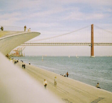
Featured image by Nick Bondarev