Typography is an essential visual component of design. Officially, typography can be defined as the technique of arranging types to make an appealing design. An intentional font arrangement has the power to profoundly enhance a design—or do the opposite. There are some standard typography rules to follow, but you have the power to embrace your own creativity. You can do this by pushing the design boundaries in order to find your own unique design expression.
Similar to all aspects of design, typography has evolved through various trends and advancements over the decades.
History of Typography
Typography originated from the eleventh-century Song dynasty in China by Bi Sheng (990–1051). Since then, we’ve made major advances in typography, as we have moved from movable type to typewriters to today’s ever-evolving digital spaces. Moving away from analog ways of arranging text has enabled endless creative possibilities.
With new technology, we are able to use text in ways that improve our chances of reaching the right audience. Before a viewer can even interpret what the text says, typography design can create a mood that sets the tone for what a brand stands for. For example, a modern sans serif font like Lato can work to portray a more contemporary brand, while a serif typeface like Caslon can work to set a more traditional mood.
Creative Typography Ideas
As design software advances, we have the power to create whatever we dream up. Here are some creative typography ideas you can use to push the boundaries and inspire your next design project.
Letters as Cartoon Characters
This technique is a way to add a playful aesthetic to your typography design. You can play around with the different letter shapes to create various characters. For example, using a U to create a smile on a cartoon character is a fun way to reimagine your text.
Overlapping Characters
Overlapping characters is another unique way to create different design elements in your text. This can be done by intertwining two words together or by using a small amount of big text in the background of a larger amount of small text. Remember, it’s important to put legibility first when you’re overlapping characters.
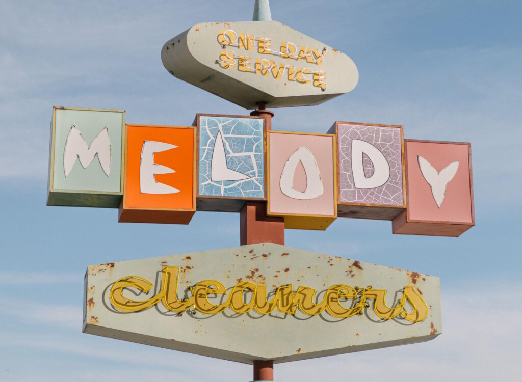
Retro Styling
Nostalgia has the power to stir up warm and fuzzy emotions, so don’t be afraid to embrace retro elements in your designs. Retro styling in typography can be achieved by inspiration from the 60s and 70s with block letters combined with ornate text flourishes.
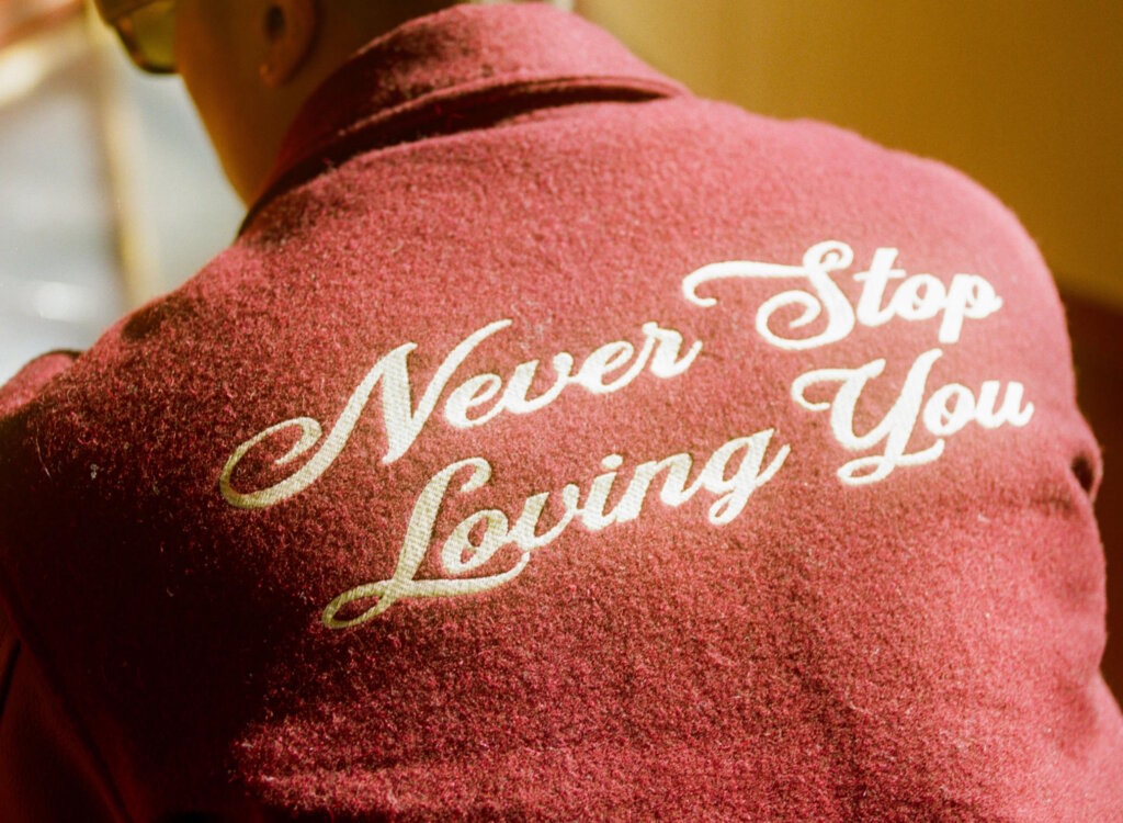
Handwritten Styles
Handwritten styles have always been on trend, as they add a “personalized” element to any design. This approach has extra value today, since it adds a human touch that stands out in the digital age. You can use handwritten styles by either creating your own or choosing from a wide selection of pre-made, handwritten fonts.
3D Effects
There aren’t really any set rules to follow with 3D. The main concept here is creating depth within the text so it pops from the background.
Glitches and Distortions
Both of these styles are unique ways you can add customization to your text. This technique reflects back to the nostalgic y2k trend, and it can be achieved by color static, line distortions, or pixelated glitches.
Floral Typography
Mixing floral elements with typography can add an elegant, romantic aesthetic to any design. This can be done by adding florals inside your text or creating floral decorative elements to go alongside your design.
Combining Uppercase and Lowercase
This technique is all about creating juxtaposition between two different kinds of text. You can either use this with one font in uppercase and lowercase or experiment with different fonts in both variations.
Fit into Geometric Shapes
Placing your text into unique shapes is a fun technique. You can distort your text to fit the geometric shapes or clip your text into any shape as well. This is an especially useful tool for logo designs.
Play with Colors
Colors and typography have always gone hand in hand. Playing around with different color combinations can create a unique typography design whether it’s in a logo, book, or branding design. Colors can also be used to emphasize specific parts of your text.
How to Create Unique Typography
Feel free to use these typography styles to experiment with your own design projects. With typography, it’s all about balance and contrasting styles when choosing your fonts. You don’t have to follow any rules here, but being intentional about your typography design will allow you to create something unique for your brand or design.
Before you begin to try out these different design ideas, it’s important to also get familiar with the basics. This will help you create a strong foundation to experiment with different font pairings, typography distortions, and various text effects.
Size, Leading, Scale, Hierarchy
Being intentional about typography size is important to creating an effective design. Every font has a different size, and it’s important to keep that in mind when you are choosing and designing with different fonts.
Leading is the vertical space between each line of text. Kerning is also another customization that controls the spacing between letters. These can be altered to completely change the mood of a design.
Scale and hierarchy are used to organize elements of your design. You can implement this by creating a hierarchy of text you want to highlight with size, color, and font weights. When designing, keep in mind what parts of your content you want to accentuate and what is secondary. A way to categorize your text is in headers, subheaders, and body text.
Understanding Design Grids
A design grid can be an important tool, especially when it comes to using typography. This can be extremely helpful if you’re just starting out as a designer. You can add a design grid in most design programs. This will allow you to achieve design harmony by either creating symmetry or exact alignment.
Practice Correct Alignment
Text alignment can make or break your design. With that said, different design situations will need a unique alignment depending on the placement of your text. A good place to start is by left-aligning text as this is the most common alignment, and it’s generally easier to read. If this doesn’t look right, try centering aligning your text if you have somewhat even text lines. Be sure to always keep the space between each line of text consistent throughout.
Keep It Minimal
Less can be more when it comes to typography design. By keeping your style more minimalistic, you allow the fonts to stand on their own. With that said, it means that you have to be confident that your typography design doesn’t need any extra design elements to convey your messaging.
Create from Scratch
One of the best ways to create unique typography is creating your designs from scratch. This can be done by creating your own fonts or text so you have a design that can’’t be replicated. This will help you stand out from the crowd as opposed to using more common, free fonts.
Combine Letters
Combining letters is an unexpected way to push the boundaries of typography. This is a trend that has been seen mostly in poster design, and it creates a funky, vine-inspired aesthetic. Be sure to choose letters that differ greatly from one another so the combination looks intentional.
Mix Font Styles
There is an art and science to mixing different font styles. This is another avenue to push the boundaries of typography. You can create fun combinations by choosing fonts that make an unlikely pair, like a bold sans serif modern font with one that’s more thin and traditional.
Break the Rules
If you’re looking to push the boundaries in your typography design, it helps to know when and how to break the rules. First, it’s important to understand the basic rules of design, so you can effectively step outside the box on them. This can be done by pairing unexpected fonts together, playing around with surprising color combinations, or purposely playing around with uncommon sizing, kerning, or alignment.
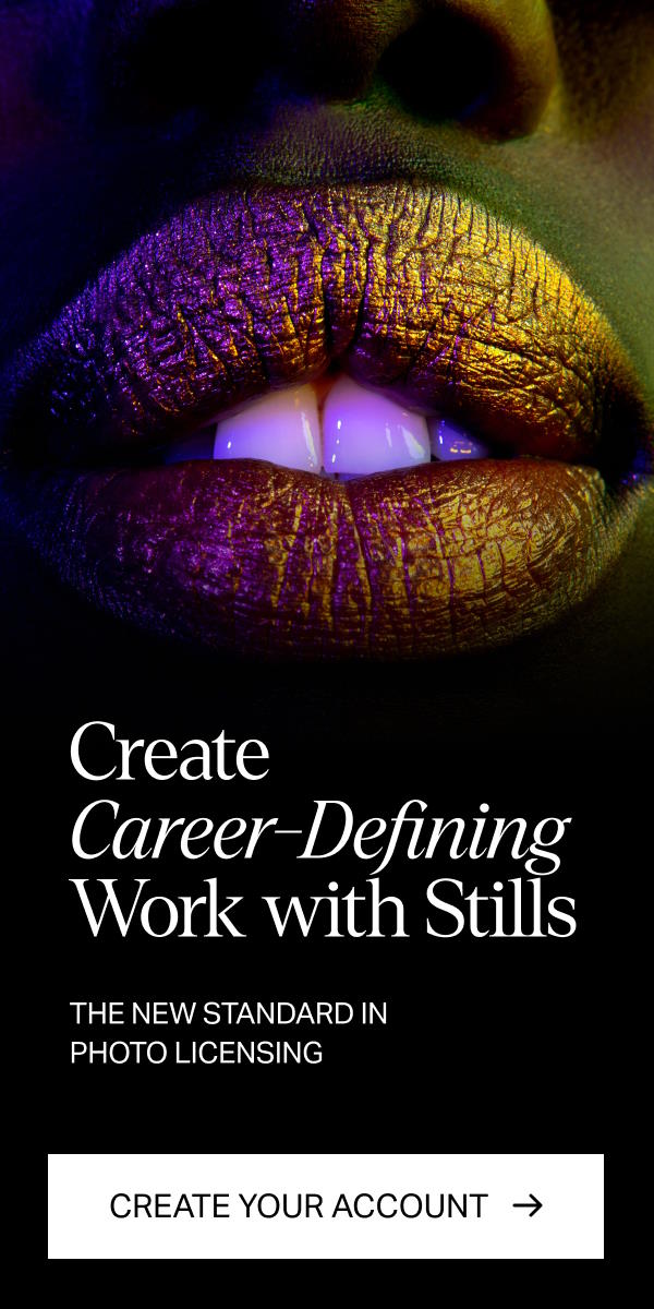
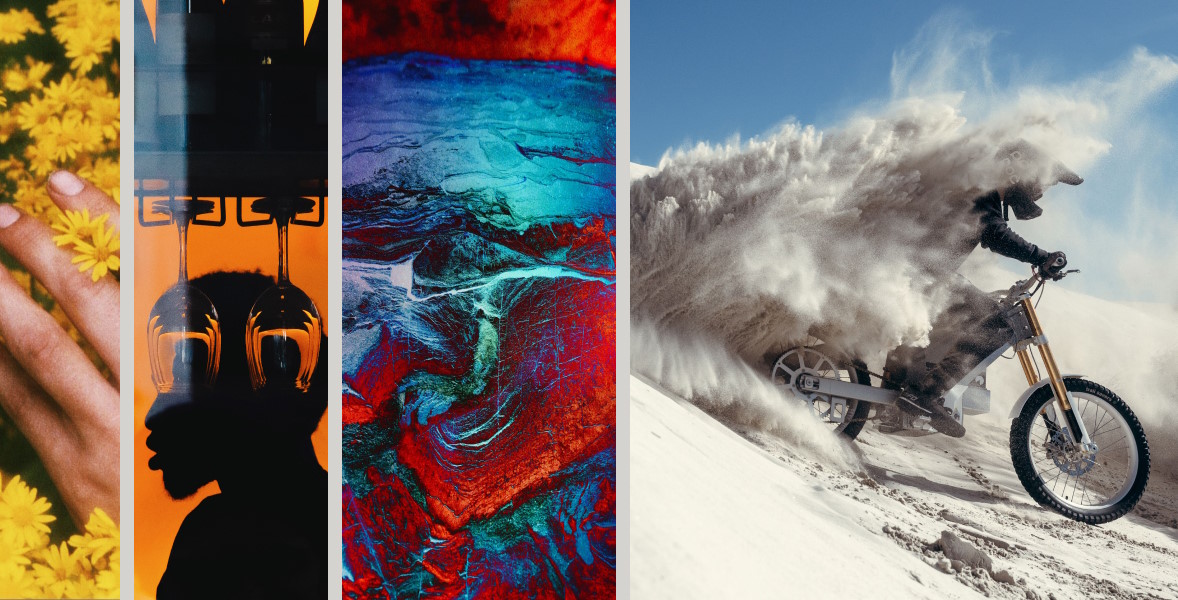
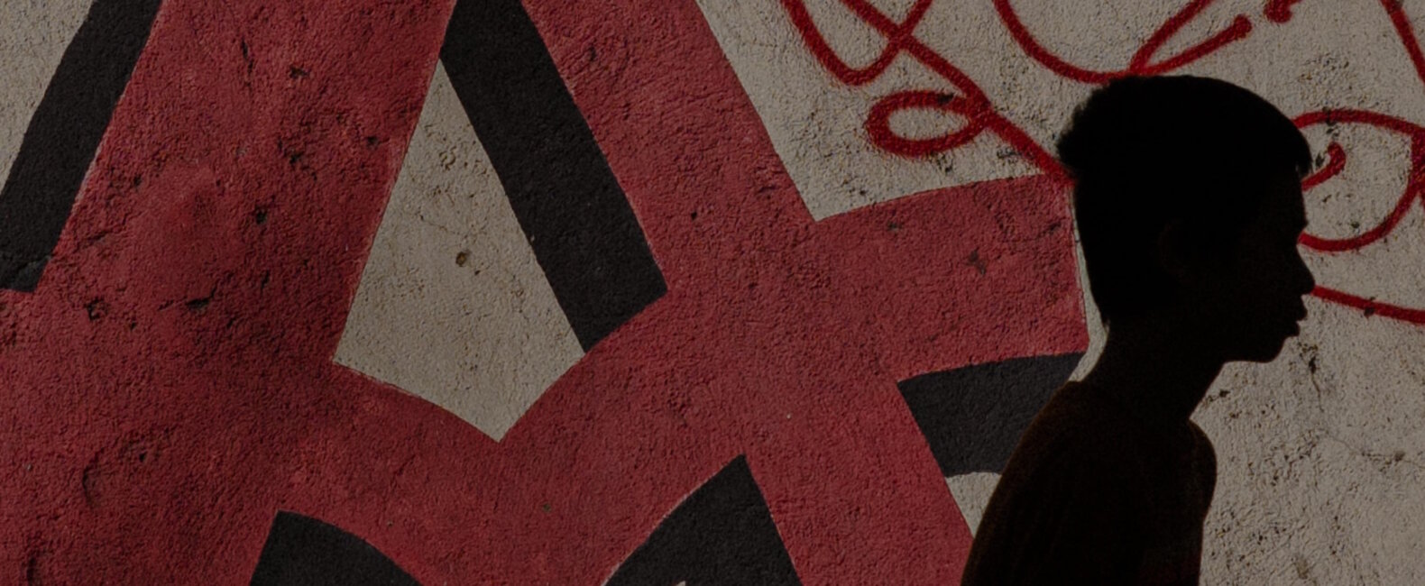
Tired of using bleak stock images?
Try Stills, a photo licensing platform for exceptional designers.
The New Standard in Photo Licensing
Typography Trends
New typography trends are always emerging in social media, cinema, and branding. Below are a few of today’s top emerging typography trends. If you embrace these new trends in your brand, it allows you to stay relevant while putting your own creative spin on it.
Vintage Narrow Serif Fonts
This trend is a reinvention of a classic typography style that makes a timeless statement. The traditional serif fonts are heightened to create a surprising combination of elegance and boldness. This is ideal for brands looking to portray a subtle but fresh take on more classic design elements.
Art Deco Reinvented
A new take on art deco-inspired typography has emerged in all forms of design. The traditional art deco movement can be characterized by tall sans serif fonts paired with surprising curves. This trend takes this vintage style and reinvents it by toning down the more decorative elements to create a more subtle approach.
Colorful Text Gradients
Gradients have always come and gone when it comes to design trends. We are seeing intentional, vibrant gradient effects added to text. You can embrace this trend by experimenting with different color combinations and unique gradient placements.
Superhero-inspired Text
This is a strong trend that’s common in cinematic design, but it’s starting to pop up more in branding as well. This action-packed trend is full of 3D lettering, retro tributes to all your favorite superhero movies, and movement created with different text effects.
Liquid Chrome Typography
Liquid chrome typography takes funky y2k text and reimagines it into melting, metallic letters. This can be achieved with speciality premade fonts or you can create your own using software rendering techniques.
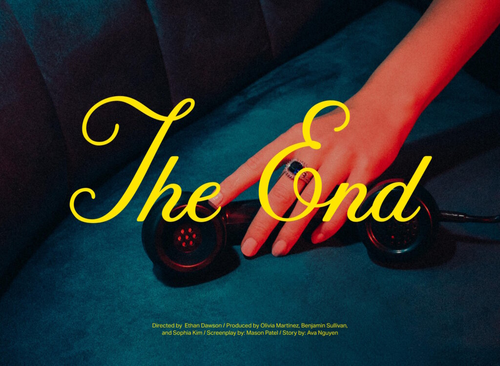
Typography and Images
It’s vital to be intentional about typography when placing it over imagery and photography. This combination can be used to further convey a message or give more context to the image. It is essential to always begin with high-quality images, and Stills is an incredible resource for that.
Typography has a unique power to create a lasting impression on viewers. This is why it has always been a key part of branding, communication, and design. Now that you have the tools to get started with your own typography designs, feel free to push the boundaries and experiment with your own fresh take. We have provided you with a guide to get started, but there are endless possibilities when it comes to using typography to find your own design personality.
The cover image via Faizal Westcott.