Designer and agency founder Jessica Walsh has led branding and campaign work for Netflix, Google, Apple, and more.
And while each of her agency’s incredible campaigns are unique, they all have one thing in common: they utilize the power of images to stop the audience in their tracks.
Hear more from Jessica on the power of images with a behind-the-scenes look at some of &Walsh’s most iconic campaigns and imagery—some of which you can even license for your own projects on Stills!


Stills: How do images play a crucial role in effectively communicating the right messages in a marketing campaign?
Images can cement a brand or message in culture in a way nothing else can. To create the story you are trying to tell, it is important to consider the goal of the piece, its placement, and the audience it’s meant to reach. Is it on Instagram where you have to catch people’s attention quickly? Is it a subway poster where people have more time to read it? Is the image meant to speak to a millennial, or is the goal to reach as wide of an audience as possible? If it’s a billboard, what country is it in, and what is the advertising landscape there? After understanding the context, step outside of yourself and imagine yourself in the shoes of a person from the target audience. If you came across this work in the context it will be placed, how would it function? If the goal of the piece is humor, does it make you laugh? If the goal of the piece is to use beautiful form to capture someone’s attention to bring awareness to a product, is it strong enough that it would make you stop and look at it and remember it? To effectively communicate, you have to place yourself in the viewers’ shoes and create the world you want them to see.
For Ted Countdown our goal was to get more people to take action for the climate. Whether it be an individual, a business person or a teacher everyone needs to have a role in order to get to net zero emissions. So we had to step into the shoes of these people to understand why they had yet to take action. What we learned was that people felt helpless as it came to climate change and in turn didn’t really pay attention to the rallying cries or the fear mongering. We decided to go a completely different direction with the brand and imagery: apathy. We created messages like “We give up” or “We love natural disasters anyway,” which were signed by TED to hopefully shock people into realizing that the climate catastrophe won’t be solved for them. This was accompanied by brand visuals designed to create an urgency to take action.
How can an image make your campaign?
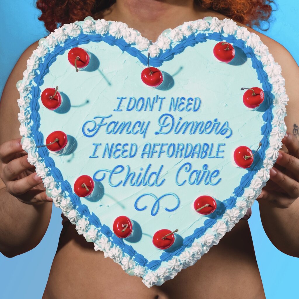
The most successful images evoke an emotion or reaction. Too often, we are told to suppress idiosyncrasies or opinions out of fear of how “consumers” will respond. The problem is that when you try to please everyone, you wind up with an image that says nothing. Let’s take this image that I posted on Valentine’s Day last year. We used a day that is typically associated with sex, chocolate, and romantic relationships to discuss important topics about identity, equity and bodily autonomy. The image itself uses bodies and Valentine’s cake motifs to grab attention in an ironic way. We always look to find tension in the images we create so that we can emotionally connect and get people’s attention.
How can an image further your message? How can it expand or bring new life to your ideas?
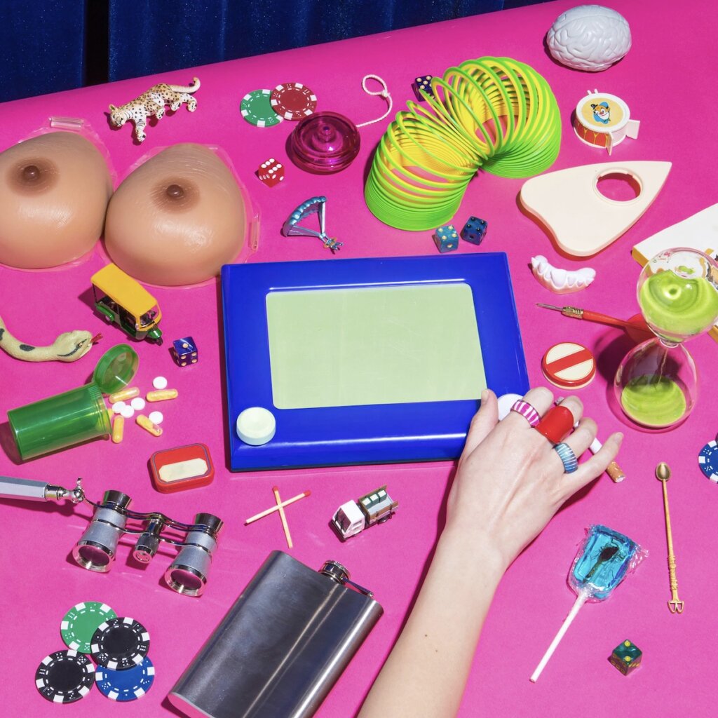
Images can be very powerful for getting people to stop and think about your message.
For example, “Sorry I Have No Filter” is a photo series born in response to the toxic positivity and manipulated perspectives we experience on social media. It’s also been an outlet for me to share my thoughts and emotions in a raw and honest way.
In recent years, I have used this project to talk about social causes and share resources for petitions, donations, and sharing diverse voices.
These images are a small piece of a bigger picture but have the potential to start conversations, make people think differently, or mobilize people to action.


How do you make sure that the images resonate with the target audience?
We create and select images for audiences based on the insights we uncover in strategic work. We then ask ourselves will this image emotionally connect with the audience? Is it true to the brand? Is it different from the way other brands in the space are presenting themselves? We also think about the context of where the image will be seen. An image used on a billboard has a different selection criteria than a social media ad. These questions allow us to be very purposeful in every image we select for the brands we work with.
One example of this is the recent “Big Vagina Energy” campaign that we worked on for Olly. The campaign was all about confidence, reminding women that their bodies should never be an apology. The images in the campaign were designed to represent a world full of pride and confidence in our vaginas through bold colors, diverse talent, and confident poses. Was this campaign message for everyone? No. But what it did do was emotionally connect with anyone who has felt shame about their vagina or even saying the word “vagina.”
What can push imagery into that small category of being meaningful and standing out?
The difference between memorable and forgettable imagery is often whether your image is following a trend, or setting one. Great imagery is ownable and distinct. If you make your images look like what everyone else is doing, it’s going to be hard to be memorable. When Rihanna launched Fenty, those images that showed the diverse range in skintone were incredibly powerful because it was true to the brand and a style of imagery that felt really fresh. However, I couldn’t name any of the brands that followed the same image style after.
So, how can you stand out? I find that setting constraints for yourself is the best way to discover your own style. The constraints you set for yourself can be anything. The tighter and the more unusual the constraints, the easier it is to do something unique. This applies to any kind of creative work, not just photography or design.
What’s your advice to designers for pushing more powerful, memorable, and meaningful imagery?
One of the best ways to push your imagery to be more powerful, memorable, and meaningful is to do the legwork before you get to creating. Great work often starts with the question, “Why?” What are the struggles in your life? What are the things you are unhappy with that could be improved? These could be things that bother you in your daily routine, things that bother you about yourself, or things you think can be improved in the world. Create a list of all these “Whys?” and hone in on the ones you’re most passionate about. The things that excite you and infuriate you most are the ones you’re more likely to dedicate your time following through with. Next, ask yourself what your work can do to fix each of these problems. How can you capture these questions and feelings? Maybe your imagery doesn’t answer the question of “why,” but brings attention to the topic you want your audience to think about. Powerful imagery can come from pivotal moments, but it can also come from research and intentional storytelling.
Let’s go back to the “Sorry I Have No Filter” series that I mentioned earlier. This series was born in response to the “why’s” of toxic positivity and manipulated perspectives we experience on social media. This photo series was an opportunity for me to share my thoughts and emotions in a raw and honest way, and it ended up resonating with folks also looking to have authentic conversations about social media standards. As my platform grew with this series, we also saw a shift in social media becoming a place to promote social justice. Collectively, we began asking tough questions, challenging the norms, and seeking solutions through imagery. Sorry I Have No Filter became another opportunity to to create powerful images, but this time it was focused on highlighting issues such as gun violence, reproductive justice, international women’s rights, child marriage, access to education and literature, and more. One image has the power to spark a chain reaction of positive change.

How do you help clients understand the role that photography will play for their brand?
Photography is powerful; it can cross cultural, geographic, and language barriers, making it a key component for any brand to emotionally connect with their audiences. To help clients understand the world we can create through photography, we present the overall direction through reference imagery in tandem with the rest of the brand’s assets (i.e. logo, color, type etc). We like to show our clients how everything comes together holistically so they can get a sense of how photography completes and fits into the entire brand world we are building for them.
What is more important, the design or the photography?
There is not one that is more important than the other. We look at all of our brand elements and decide where there is an opportunity for a brand to be most distinctive while also being true to themselves. Sometimes that is through really unique photography, sometimes an illustration system or even a graphic solution. We do not go into any project ranking one solution more important than the other but we do discover where to put more emphasis on a brand once we go through the initial strategy work with them.
Hear more from Jessica on creating seamless photo shoots and be sure to check out &Walsh’s collection of imagery, all immediately ready to license for your own projects.