Visual hierarchy is the arrangement of design elements based on importance throughout a composition. It is a fundamental component of social media graphics, websites, print materials, app design, and more.
Our world is overloaded with constant competing information. As attention spans grow shorter, a designer must work precisely to guide a viewer’s focus. Mastering the art of visual hierarchy will ensure clear messaging and engaging designs.
If done correctly, visual hierarchy elevates your messaging. It uses size, scale, color, alignment, and negative space to draw attention to the key elements of a composition. All of these principles work together to impact comprehension and create an intuitive flow throughout the design.
The first step in any design is assigning levels of priority to each element. Understanding how a person perceives visual information is necessary in setting this up. A designer must then create a sequential visual experience for the viewer to draw the eyes to what’s most important. Here are the ways to approach the best practices in design hierarchy from all angles.
Traditional vs experimental approaches
As with any design principle, visual hierarchy is approached in both traditional and experimental ways. In order to push the boundaries, a designer must understand the foundations of this concept. From there, you can put your own creative spin on it by experimenting with more innovative ways to guide the viewer’s eye.
Traditional visual hierarchy
A more traditional approach in design is having the header at the top in the largest font. From there, the secondary elements are scaled based on their priority. This usually starts from the top and works its way down in a traditional sequential order.
Brighter colors can be used to highlight more key elements of the design. Contrasting colors can also work to make one part stand above the other. This traditional approach usually sticks with a more predictable arrangement of hierarchy. A traditional example is an ad campaign that contains large, bright-colored text with smaller, muted secondary text below it.
Experimental visual hierarchy
Once you gain an understanding of traditional visual hierarchy, it’s time to experiment. Experimental visual hierarchy is about knowing when and how to break the design rules.
Even in visual hierarchy, design trends tend to be overused and a viewer can get bored of predictable compositions. This can be beneficial especially in marketing campaigns as it will allow your designs to stand out amongst the competition. You can move out of the usual design that your viewers are accustomed to seeing.
It’s best to start out by breaking one or two design principles when it comes to an experimental approach to visual hierarchy. Some examples of experimental visual hierarchy are highlighting the secondary text with brighter colors, inverting sizes of important and secondary elements, and playing around with a non-traditional font that draws attention to elements you wouldn’t otherwise want to be highlighted.
Experimental visual hierarchy in advertising or web design has the power to attract attention in a different way. It might create an unexpected reaction from the viewer to take the time to look further into the design.
Visual hierarchy through different mediums
Visual hierarchy can have different approaches depending on where it is being displayed. Although there are similarities, each hierarchy has a unique intention depending on print or digital design. This can also differ whether the composition is in a static or interactive configuration. Here are the best practices for each.
Print design
Print is the most traditional form of design. It is usually digested slower than digital art and leaves space to be more experimental.
If your print design is text-heavy, it’s important to have the viewer’s eye be led to the most prominent writing first. This can be done easily with scale, color, and alignment. Above all else, it’s essential that the design is clearly legible no matter what hierarchy exists. Create a priority scale for each element and design accordingly by using a consistent design system. Imagery can be used to break up a layout and hierarchy if it adds to the overall messaging. High quality photographs are important in print and Stills can be a great resource for that.
Digital design
As more of our world becomes digital, this is where visual hierarchy becomes most important. It’s all about creating a highly optimized user experience and intentional flow. Digital designs need quicker impact because a user has the power to scroll away instantly.
In web design especially, it’s key to guide a user intentionally through what buttons or links you want them to click through. Each page will have its own hierarchy and it’s helpful to look at each page as its own composition. They each will consist of having their own hierarchical needs depending on the unique user’s experience.
Static vs. interactive design
There is a whole different approach when it comes to a static or interactive design. Static design can be social media graphics, infographics, resumes, or read-only websites. This means the contents of the design are fixed rather than creating a fluid user experience.
Visual hierarchy in a static design is more like print design in that it has more space to create an impact but it needs to be done quicker. Since there is no interactive piece of this design, static hierarchy depends on the content layout more than anything else. It’s important to understand what elements need to be prioritized and keep a sequential format in that alignment. Keep the differences obvious enough so it’s easier to differentiate what is being prioritized.
Interactive design is especially important because the way a viewer works with this will dictate their opinion of a brand or product. Viewers are always drawn to any form of movement on a website or other interactive platform. Text is usually the last element people process. If a certain text is at the top of your hierarchy, you must use scale or color to emphasize this.
Highlight with color
Color is one of the best ways to emphasize a design element in your hierarchy. Human perception of color is powerful in drawing attention quickly. For example, a bright neon green will draw attention to a headline text more than any other design treatment. You can use color to create impactful focal points whether in text, a frame around an image, or a colored vector icon.
Color can also be used to train the viewer to click on certain buttons. This can be achieved if you use this color repeatedly in your call-to-action areas of design. It’s also important to note how different colors interact with each other. For example, if you are using a bright red color to draw attention but not paired with a contrasting background you can lose the intended impact.
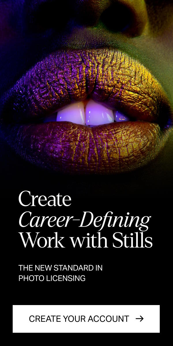
Tired of using bleak stock images?
Try Stills, a photo licensing platform for exceptional designers.
The New Standard in Photo Licensing
Font palette hierarchy
Font combinations are another important aspect of any design especially when it comes to visual hierarchy. You can use your font palette to work in favor of what text you want to emphasize.
Usually, there are 3 fonts in a palette which consist of a header, subheader, and body font. The hierarchy here goes in sequential order. Traditionally, you would make a header font stand out amongst the rest. If you are looking to experiment you can play around with unconventional font combinations here.
If you want to make things minimalistic, try sticking to one font family but adjusting the font weight and size to create a visual hierarchy for different levels of text. Many font families offer a wide variety of weight variations so be sure to look out for that when choosing a font for your design.
When mixing type and images, choose images that have enough negative space to allow for proper text legibility. An image can be a secondary component in your hierarchy to highlight your text. You can find some photos that will work well with text in Still’s extensive library.
Cultural context in design
Design is an art form that will always be subjective to the viewer. Cultural nuances can play a role in the effectiveness of visual hierarchy. Our culture and society have a significant influence on human perception of shapes, text, and colors.
Designers must take cultural influence into account when creating a visual hierarchy. For example, when creating a brand for a Japanese company it would be important to keep simplistic content layouts and minimal branding. This may not be appropriate for other cultures that are attracted to a more elaborate approach, or even specific colors.
It’s essential to understand how different cultures digest visual information so you can create an effective visual hierarchy that speaks to them. This is another way to be intentional about your design choices in guiding your audience through your composition.
Visual perception of hierarchy
Human perception and cognitive psychology play an influential role in an effective visual hierarchy. It’s human nature to want to find structure by grouping together elements in a pattern for better understanding. Our interaction with visual stimuli affects how we perceive and act upon certain designs. This is especially relevant when it comes to visual hierarchy in advertising or web design.
Cognitive psychology can help enhance the user’s experience by improving navigation, accessibility, and readability. A designer’s job is to design based on what an audience’s behavior would be when presented with a specific visual. Understanding how psychology and human perception play a role in design can help you find solutions that can potentially make a great impact on sales and conversions. In e-commerce, it’s important to create a visual hierarchy that allows the customer to quickly digest information so they can make better buying decisions.
Imagery has the power to evoke emotions and can be perceived differently depending on the placement in the hierarchy. If you are using photographs in your design, be sure to choose ones that play a role in the overall visual experience. Not only is a viewer’s behavior a key consideration in a visual hierarchy but it can also impact their retention. A hierarchy can guide someone to stay on a certain webpage long enough to digest the information concisely before moving on to secondary pages. If information is organized and clear, a conversion is more likely to happen over a less intentionally thought-out hierarchy.
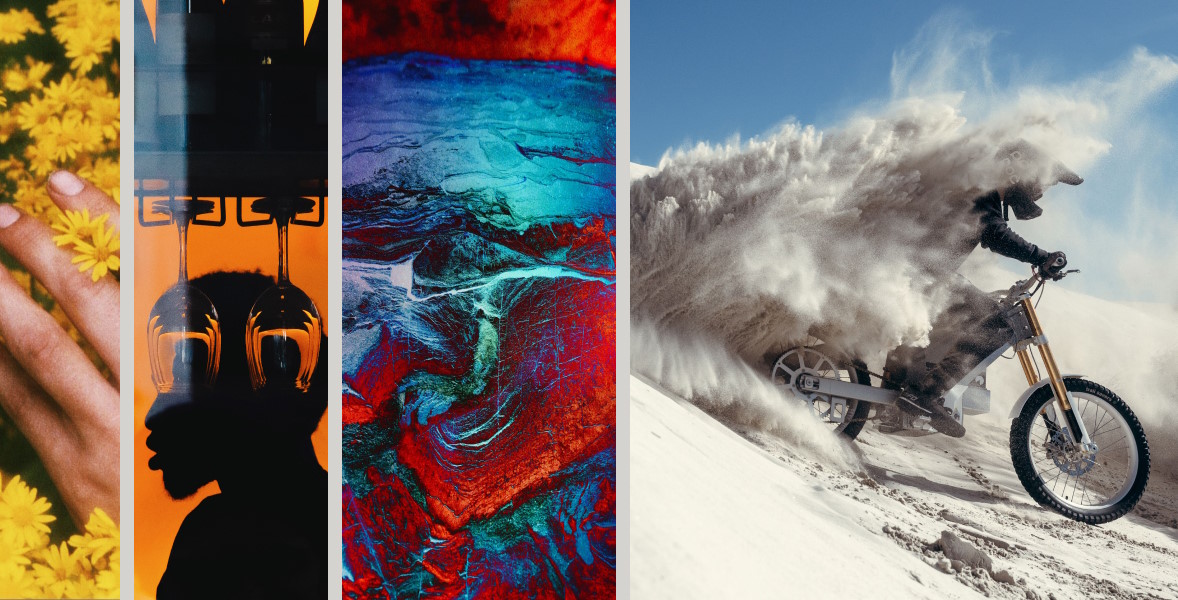
Mastering the art of visual hierarchy takes time and practice. Start by gathering inspiration to gain an understanding of both traditional and experimental designs. Stills offers a comprehensive library of images to choose from.
Once you understand the traditional ways to emphasize the intended elements, you can experiment and push the boundaries. Rules can be broken if you work to find a better, more innovative design solution. Experimentation in the visual hierarchy will not only draw your audience in but will separate your work from the predictable. With practice, you will find opportunities to design more effective hierarchies with room for your own creativity.
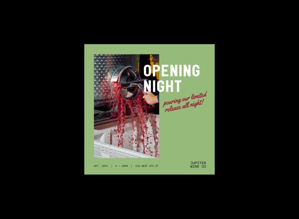
The cover image via Max Chesnut.