Vintage design is making a big impact in today’s graphic design trends. Whether it’s a reemergence of Art Deco patterns, retro typography, or Mid-century aesthetics, these elements show up in brand identities and ad campaigns, pulling on the nostalgic heartstrings of an audience.
It’s always relevant to be on the cutting edge of design, but a vintage-inspired approach never goes out of style. It evokes nostalgia and can trigger strong emotional ties to a product or design of the past.
Identifying vintage elements
When incorporating vintage-inspired elements into your designs, it’s useful to be able to identify their origin. This will help you pull further into your inspiration to add additional historical elements to your concept. Here are a few examples of how to identify certain styles by key historical eras.
Baroque was a time period that originated in Europe from the 16th Century through the 18th Century. Elements from this era can be classified by dramatic ornaments, lavish design, and luxurious details. When searching for inspiration from this era, you can refer to Baroque paintings that evoke passion with realistic human figures.
Mid-century has been a beloved trend that continues to endure the test of time. It began in the early 1940s through the 1970s and inspired a more simplistic approach with geometric shapes and patterns, clean lines, and simplistic two-toned color palettes. Bauhaus is another style that was happening in parallel to this time which consists of minimal details, abstract shapes, and functional typefaces.
Gothic design is another historical period important to mention. Elements from this era can be traced back to influences of Romanesque art with a more somber approach. This style can be identified by dark moody color palettes, highly stylized typography, and elongated graphic elements.
Vintage elements that stand out
When planning out your next vintage-inspired design project, it is important to modernize historical elements in order to grab attention. Audiences are open to reinterpretations of this trend while being attracted to elements that tap into nostalgia. Finding a balance between these approaches is what will make a design uniquely compelling.
Simple shapes and circles
Minimal graphic elements are a timeless design that can be used to draw attention within branding, website design, and advertising. The simplicity of this trend refers back to Mid-century and Bauhaus design. Simple shapes and circles can be combined with cut-out images related to your design. Premium photographs for this collage look can be found in Stills extensive library. These elements can also be mixed with serif typefaces to create juxtaposition within the design.
Limited color schemes
Limited color schemes refer back to various retro-inspired design styles. To embrace this trend you can pair with other elements that allow you to make a bold statement. This can be done with more striking vectors or imagery. To place emphasis on a key part of your design, use a contrasting tone for one element to best utilize your vintage color palette.

Vintage typography
Vintage-inspired typefaces aren’t going anywhere. When choosing more ornate, serif typography, it’s best to mix with a modern san serif font to create balance. Pairing two opposing fonts allows more dynamic and interesting compositions. If you are limited to using one typeface, another way to stand out is by utilizing vivid colors or clean patterns to add contrast with more traditional typography.
Textures and noise
When creating a vintage design, texture and noise can be the finishing touch that makes a photo or composition look antique. Placing a vintage texture over a photograph can add an unexpected stylistic feature to any design. This allows a composition to stand out because of the positive nostalgic references it can pull from with older forms of photography and editing styles.
Imagery and illustrations
These are important elements of any design that have the power to evoke feelings from a certain era. Imagery and illustrations can be a dominant player in classifying a design as vintage and creating a unique impact on its audience. Feel free to pair vintage imagery and illustrations with modern text for a fresh new approach to your layout. You can also experiment by mixing more modern imagery with vintage-inspired illustrations or vice versa. Our eyes tend to be attracted to imagery first, so it’s essential to have high-quality images in your design. Stills can be your go-to resource for that.

Current vintage trends
Some vintage design trends come and go through cycles while others take the stage for long periods of time. The possibilities and inspiration are endless when it comes to implementing vintage and retro aesthetics into our modern designs. Two popular throwback trends that are relevant now are Retrofuturism and Pop Art.
Retrofuturism
What better way to look ahead into the future than through the lens of the past? This ‘80s style trend is all about combining imaginative futuristic design with old-fashioned stylistic themes. It blends the nostalgic fascination with things of the past with an obsession with all things tech. Elements following this trend would be rounded shapes, bright ‘80s-inspired color palettes, futuristic themes of tech and space, grunge textures, and mixes of retro mechanics and machinery. An effective example of this Retrofuturism can be found in movie advertisements and poster design where we see the past and future collide through colors, typography, and graphic elements.
Pop Art
This retro inspired trend stems from an art movement from the 1950s and 1960s. Andy Warhol and Roy Lichenstein led the way for this new stylistic approach to advertising that lasted until the 1970s. Pop art was all about using shapes and illustrations to create an artistic representation of popular imagery. It is usually done in bright pops of color with recognizable items or faces. The most famous examples of Pop Art are Andy Warhol’s Campbell Soup Can and the Marilyn Diptych.
Swiss typography also plays a role here as it consists of block layouts and bold sans serif fonts which pair well with Pop Art. During the 1980s this movement transitioned into a more punk style with grunge themes, cut out letters, and chaotic graphic elements.
Tired of using bleak stock images?
Try Stills, a photo licensing platform for exceptional designers.
The New Standard in Photo Licensing
How to add vintage and retro touches to your designs
Once you have your vintage and retro inspiration, it’s time to implement them into your creative work. Here are 3 easy ways you can add these trends into your font and color palettes while providing the right balance between each element.
Color palette
Choosing the right color palette sets the tone for your overall style in your design or brand. Colors can evoke different emotions, even when using them to relate back to a historical time period. When creating a color combination for your brand, be sure to refer to color psychology while also referencing the vintage theme you are looking to incorporate. Colors are a great place to experiment by adding an unexpected pick to your palette.
Fonts
Typography can be the ideal avenue for you to easily relate back to a vintage era. Choosing the right font will take some research into what was popular during the time period you are influenced by. It can be helpful to look back at advertisements during that time and see how various fonts were paired. If you are looking to implement a 1950s aesthetic, mix playful with clean and bold typefaces. For an Art Deco inspired look, find tall san serif fonts and pair them with geometric rounded shapes.
Balance
By now it is no surprise that the best way to balance out vintage elements is by pairing them with their contemporary counterparts. This is the best way to approach vintage design in a fresh style. It’s key to make obvious differences between two opposing styles so the dominant elements can stand out while the more modern graphics are secondary. This will allow you to create more visual polarity which makes compositions more attractive and dynamic. Design is always about balance and experimentation.
Now that you have an understanding of how to identify and use this design trend, feel free to experiment with different elements in your creative work. Retro and vintage-inspired aesthetics have paved the way for an exciting time in design. As modern designers, we have the opportunity to resurge timeless aesthetics of the past by putting our own spin on it. Throwback design styles have the power to transport the viewer into positive memories and emotions of the past.
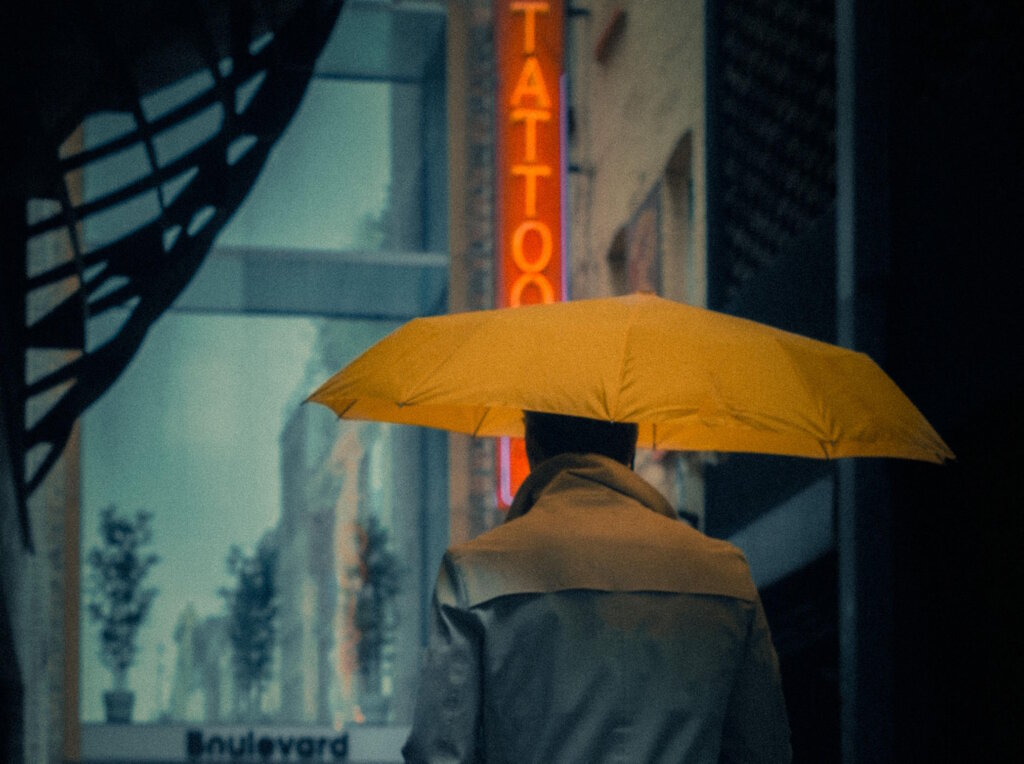
The cover image via Louis Dazey.